Lack of emotional connection
Many digital tools deliver information in a cold, impersonal way, missing the opportunity to build warmth and curiosity.
PROFESSIONAL · INVOLING AB · 2025
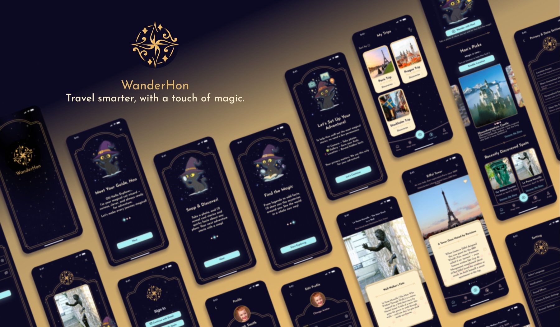
A magical travel app where users photograph a place and Hon—a cat wizard—reveals playful, quirky and historical facts about it.
THE OPPORTUNITY
Travelers often miss interesting stories because local information can be difficult to find, dry or disconnected from the moment of discovery.
WanderHon turns that gap into a playful experience: point the camera, capture a place and let Hon bring it to life with personality. My role was to shape the app from the initial idea into a tested high-fidelity prototype and a system ready for development.
Sitemap, user flows and wireframes
iOS and Android prototypes
Visual identity and Hon’s magical world
Usability testing and refinement
Design system and developer handoff
01 · UNDERSTANDING THE USER
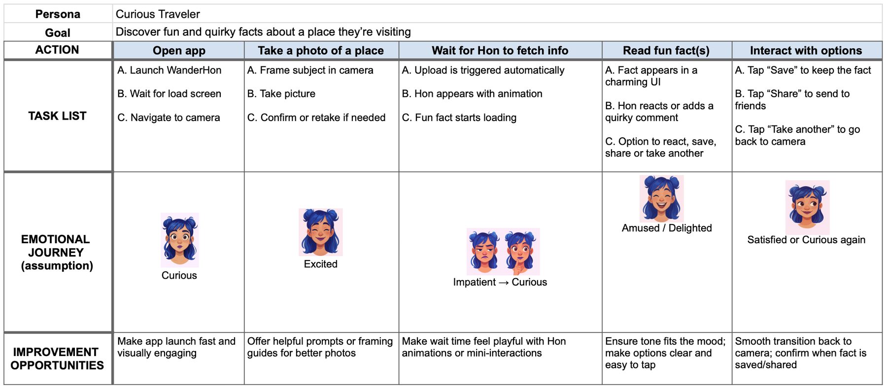
The product idea came from the client. I used a competitive audit and user journey map to anticipate expectations, surface friction and understand how a character-led experience could remain simple and accessible.
Many digital tools deliver information in a cold, impersonal way, missing the opportunity to build warmth and curiosity.
Loading and content-fetching moments can feel passive or unclear, breaking the sense of immersion.
The audit compared camera-based interaction, real-world exploration and character-led engagement rather than looking only for direct competitors.
Strength: Fast, familiar and easy to use.
Gap: Practical but impersonal, with no guiding character.
Strength: Magical, immersive and movement-based.
Gap: Complex and not always inclusive or accessible.
Strength: Playful, polished and strong at habit-building.
Gap: Its tone can feel too playful and content access is limited.
THE PRODUCT GAP
02 · STRUCTURE & WIREFRAMES
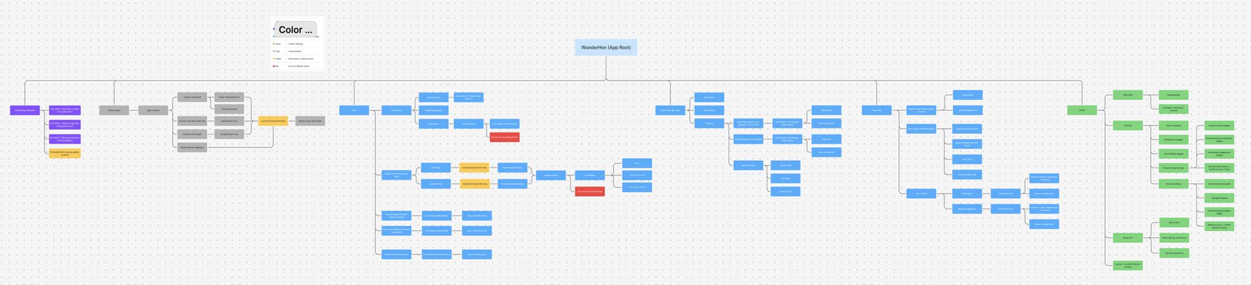
The information architecture connected onboarding and permissions with camera capture, postcard discovery, the Magic Map, saved trips and profile. User flows then made the key journeys concrete before visual design began.
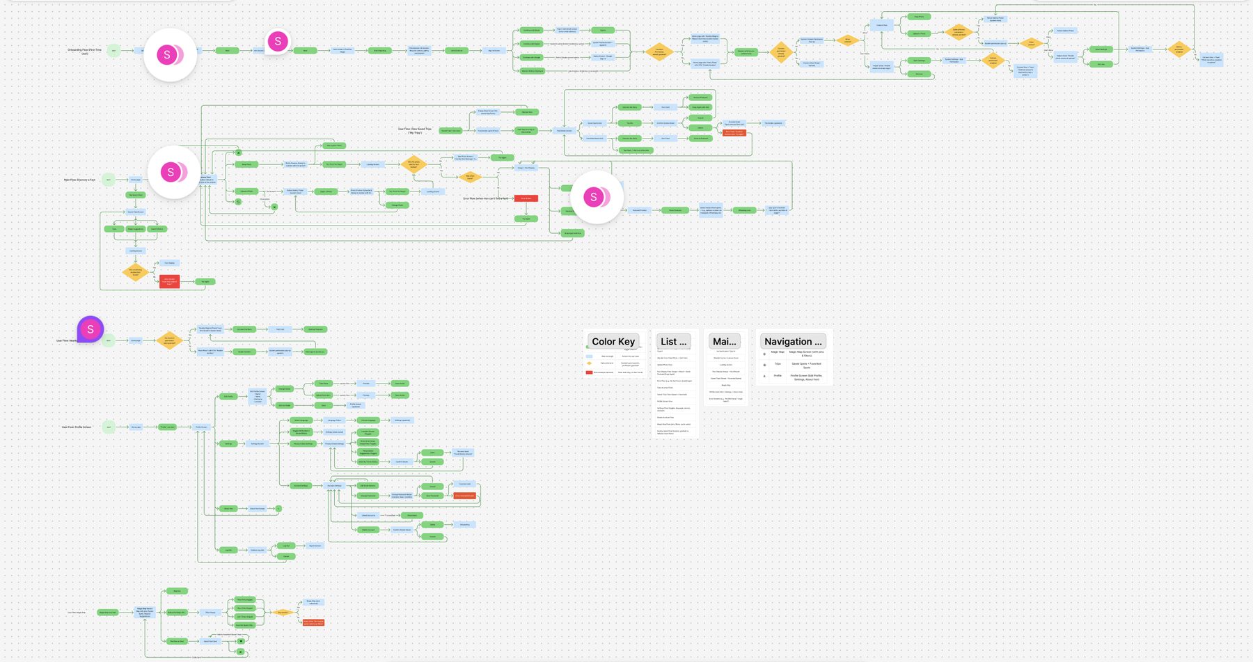
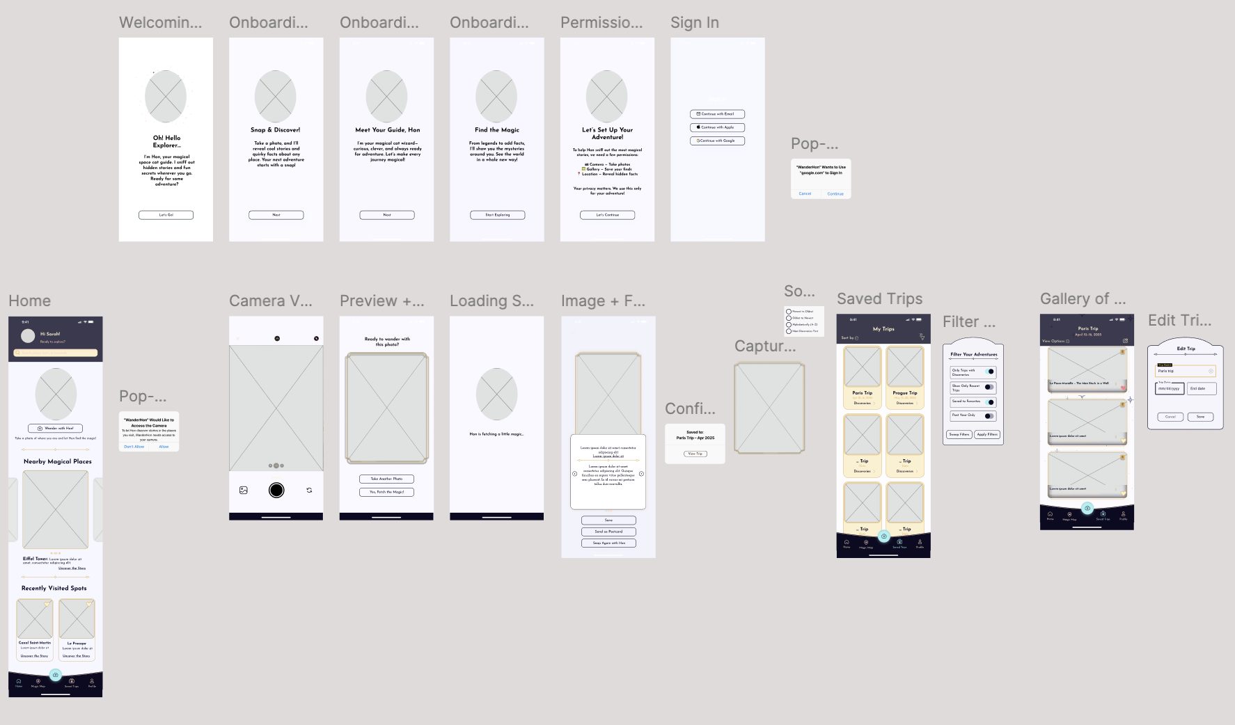
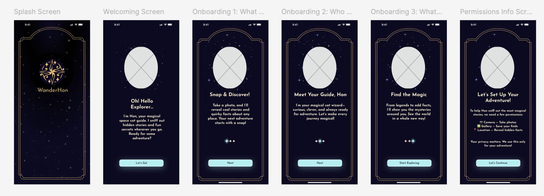
Wireframes mapped the end-to-end flow—from onboarding and permissions to camera capture, postcards, saved trips and filtering—and became the basis for the first usability test.
03 · TWO ROUNDS OF TESTING
Testing twice produced complementary insight: the first round improved the product’s structure; the second confirmed the visual direction and exposed the final moments that still needed clarity.
04 · DESIGN REFINEMENT
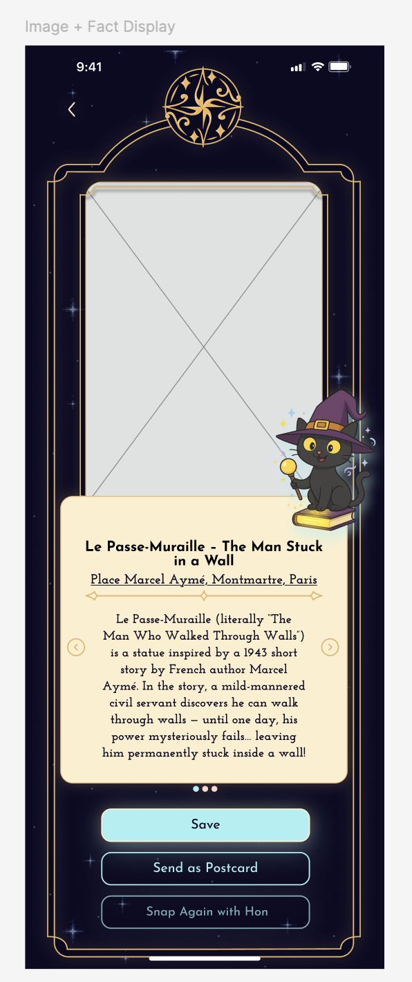
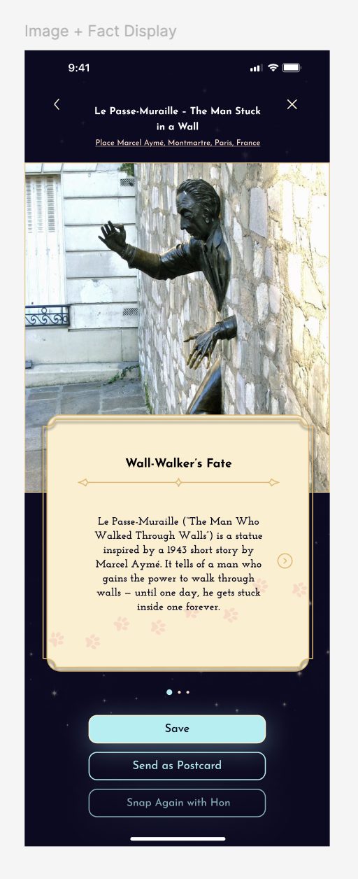
I refined navigation, clarified task outcomes and shortened the path into the experience—while making sure the whimsical interface still supported usability.
Swipe gestures joined the arrow controls so moving between facts feels faster and more familiar.
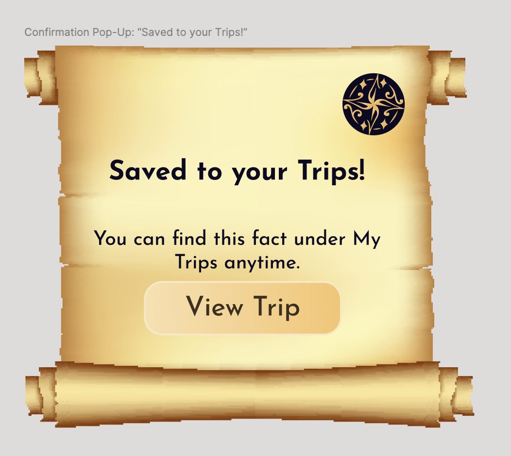
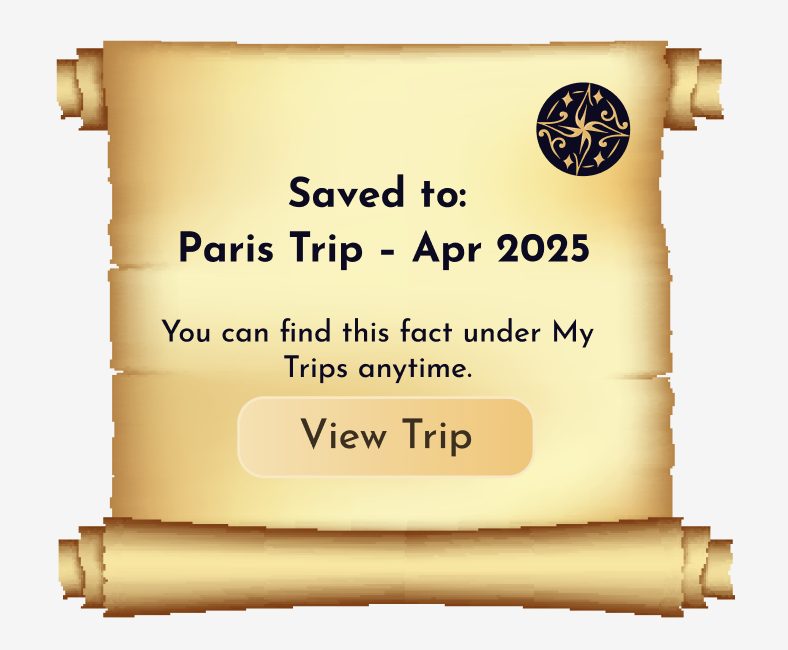
A specific “Saved to Trip” message confirms both the action and its destination.
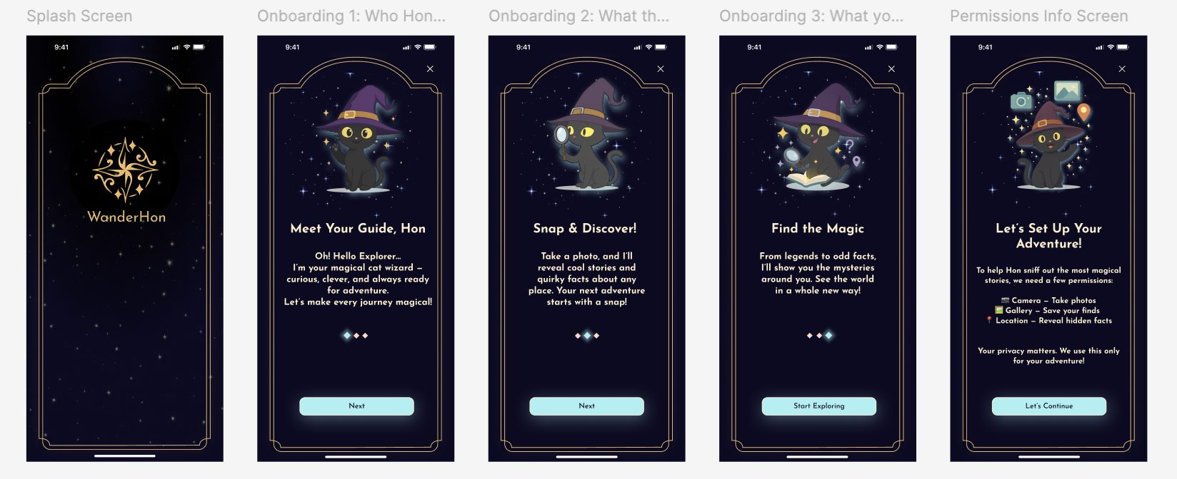
The onboarding became three focused slides with a visible Skip action.
HIGH-FIDELITY PROTOTYPE
The final walkthrough includes onboarding, camera capture, postcard navigation with swipes and arrows, trip saving and map exploration.
05 · DESIGN SYSTEM
The lightweight Figma system made the experience consistent, scalable and easier to hand off. Files, components and assets used clear naming and organization so future developers could work from a shared source of truth.
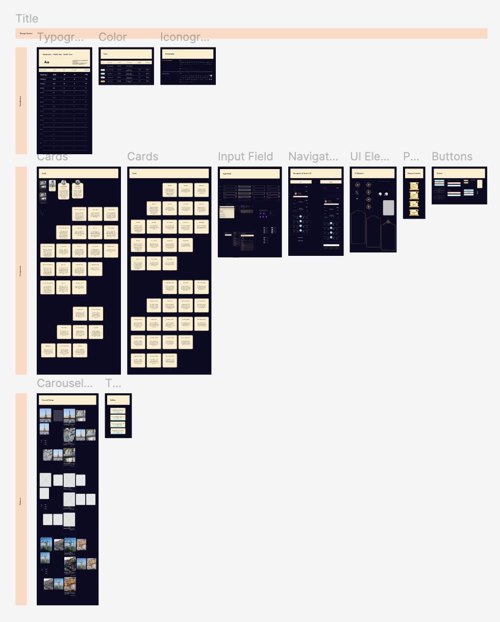
High-contrast color, friendly headings, readable body text, spacing and elevation.
Buttons, postcards, carousels, tooltips, modals and navigation bars.
Onboarding, permissions, saving and sharing, and map overlays.
Animations, sparkles, spells, art-deco frames and decorative dividers.
Larger type and improved spacing in fact cards and Hon’s bio.
Swipe interaction alongside arrows for postcard browsing.
A light-on-dark palette designed to meet WCAG AAA contrast.
OUTCOME
The project delivered a high-fidelity iOS and Android prototype plus a structured design system. Core interactions were validated before developer handoff, giving the founder a clear view of the product and how it could evolve.
Testing wireframes and high-fidelity design revealed different—but equally valuable—insights.
Character and visual storytelling build engagement when balanced with clarity.
Building the system alongside the product strengthens consistency and handoff.
NEXT STEPS
Collaborate with the incoming developer to refine implementation details.
Clarify interaction behavior during the transition to development.
Continue evolving the design system as new flows are built.
Test the developer version in a real-world context.
WanderHon is a product concept provided by the client. The concept belongs to the client; the design work shown here is my contribution. This project is shared for portfolio purposes only and should not be copied or reused.